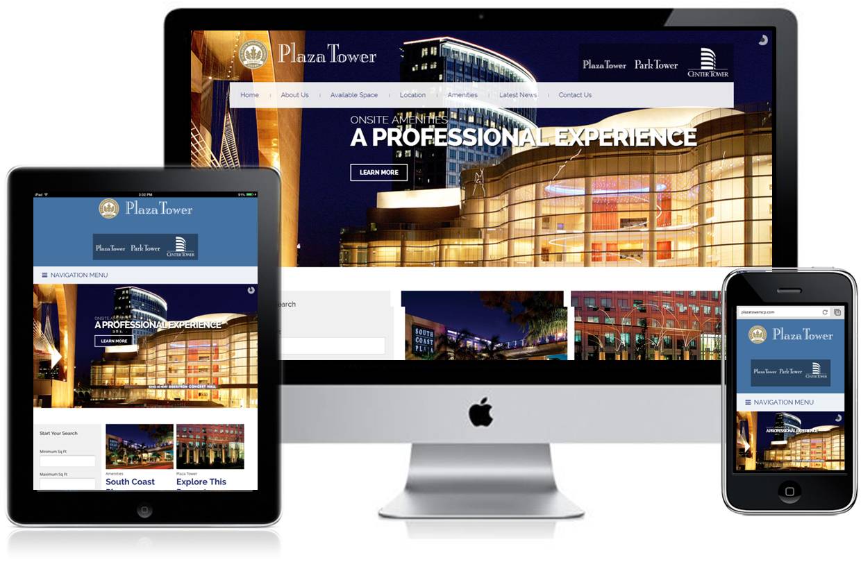
 Responsive design is needed because website browsers such as Internet Explorer, Google Chrome, and Mozilla Firefox are now on a variety of devices. Your site visitors do not care which device they access your website on. They care that the information is easy to navigate and responses to their device at the moment. A customer may visit your website from a desktop computer while at work but later visit on their mobile device while sitting in traffic or waiting in line. They expect a quality website that functions perfectly regardless of their device.
Not sure if your website has a responsive design? Go to your website on a smartphone or smart device such as an iPad. That is what your customers see when they visit your website. If your website does not adapt to the size of the screen you have likely have lost sales. According to a recent Google survey:
- 72% of mobile users say it is important to them that websites are mobile-friendly
- users are 5x more likely to abandon the task they are trying to complete if the site isn't optimized for mobile users
- 79% will go back to search and try to find another site to meet their needs
- 55% say a frustrating experience on a website hurts his/her opinion of the brand overall
Because consumer demand for mobile-friendly sites made with a responsive design Google now favors mobile friendly sites in its search results. Expect in the near future that Google will remove non-responsive sites from the search results altogether. What this means is if your site isn’t mobile friendly now you a responsive design now otherwise customers looking for you will not find you.
